The Data-Wink Ratio: Emoji Encoder for Generating Semantically-Resonant Unit Charts
Matthew Brehmer - University of Waterloo, Waterloo, Canada. Tableau Research, Seattle, United States
Vidya Setlur - Tableau Research, Palo Alto, United States
Zoe Zoe - McGraw Hill, Seattle, United States. Tableau Software, Seattle, United States
Michael Correll - Northeastern University, Portland, United States
Download preprint PDF
Room: Bayshore VII
2024-10-13T16:00:00ZGMT-0600Change your timezone on the schedule page
2024-10-13T16:00:00Z

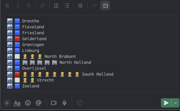
Abstract
Communicating data insights in an accessible and engaging manner to a broader audience remains a significant challenge. To address this problem, we introduce the Emoji Encoder, a tool that generates a set of emoji recommendations for the field and category names appearing in a tabular dataset. The selected set of emoji encodings can be used to generate configurable unit charts that combine plain text and emojis as word-scale graphics. These charts can serve to contrast values across multiple quantitative fields for each row in the data or to communicate trends over time. Any resulting chart is simply a block of text characters, meaning that it can be directly copied into a text message or posted on a communication platform such as Slack or Teams. This work represents a step toward our larger goal of developing novel, fun, and succinct data storytelling experiences that engage those who do not identify as data analysts. Emoji-based unit charts can offer contextual cues related to the data at the center of a conversation on platforms where emoji-rich communication is typical.